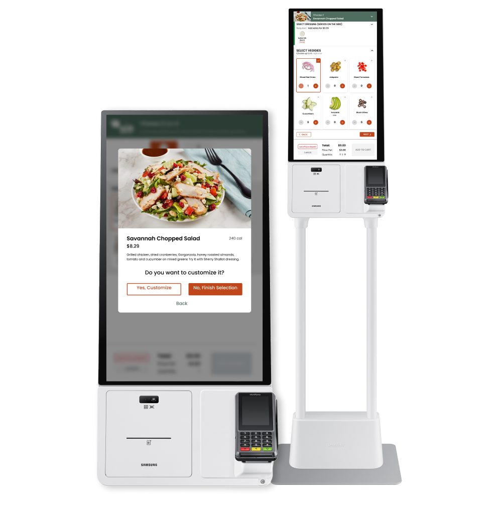
Nested Modifier - Item Customization for QSRs
Enhanced the user interface and experience for menu item customizations at national chain restaurants by streamlining processes and improving kiosk usability, resulting in a more efficient dining experience.
Company: Grubbrr
My Role: UX Research, UI Design
Teammate: Allie Pultorak
Timeline: May-August 2022
Problem
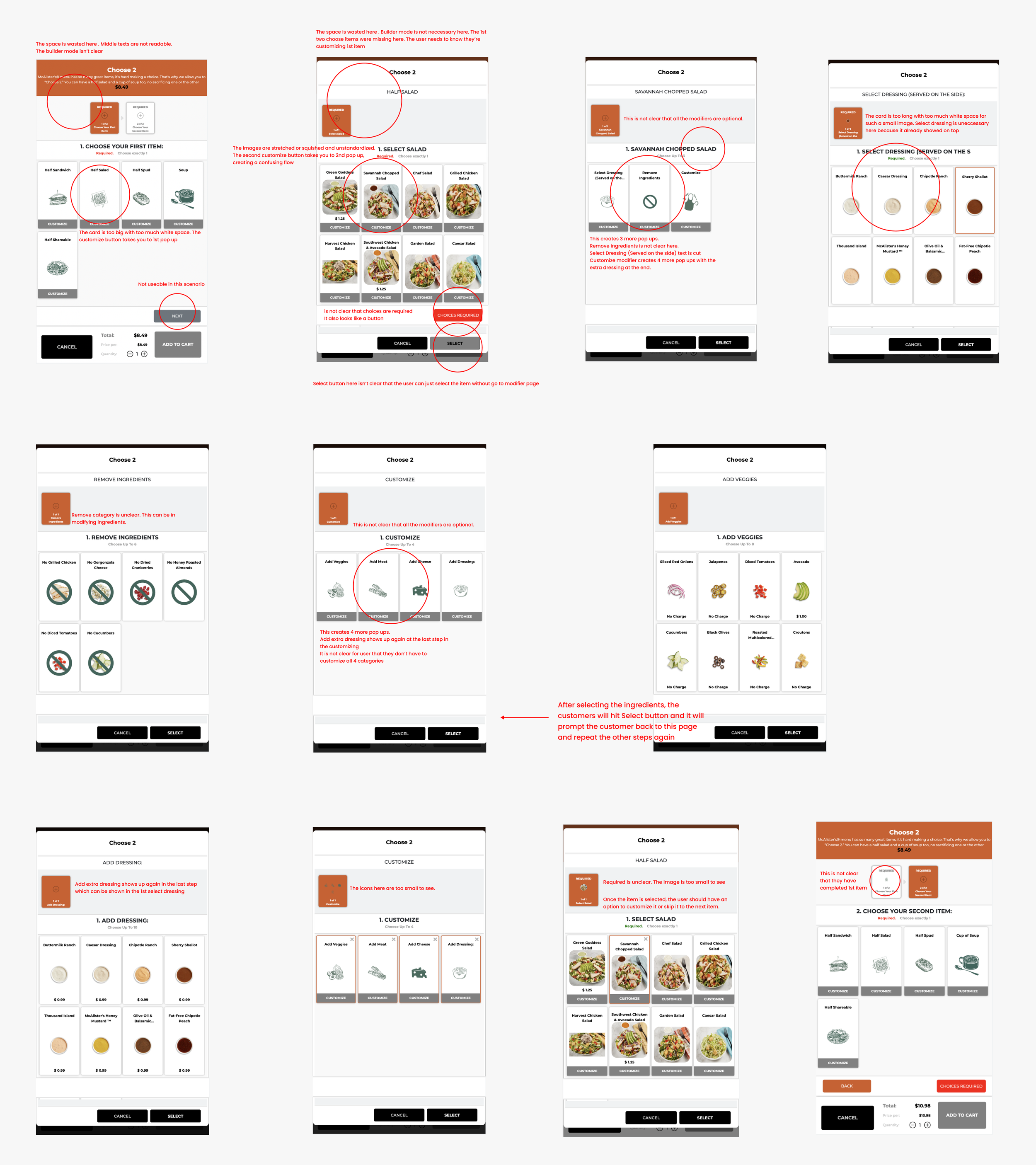
The customers give up on ordering an item because there are too many pop-ups!
One of the kiosk features enabling users to personalize their orders is called Nested Modifiers. However, when a user selects a food item, such as pizza, they are prompted to make additional modifications—like choosing toppings—that can feel endless (with options for cheese, meats, and sizes). This issue was being handled differently at each restaurant instead of consistently across all clients. As a result, developers had to create unique algorithmic solutions for each restaurant, and sometimes even for individual food items, which consumed valuable time and resources. Our goal was to devise a clear, scalable solution to this challenge that could be applied uniformly to any restaurant utilizing our software.
In this example, customers are prompted to select two items from the 'Choose 2' option. However, after choosing the first item, they are required to make additional adjustments that they may not want to, and they are continually prompted to do so until they comply. This repetitive process can lead to frustration, especially for a 'Choose 2' selection.
Choose 2
Family Bundle
To order the 'Family Bundle,' the customer must navigate through five steps. Throughout this process, frequent pop-ups appear, leaving the customer feeling overwhelmed and confused as they try to complete their order.
Choose a Burger
In the 'Choose a Burger' scenario, customizing the burger is optional. However, once the customer selects a burger, a new page appears, prompting them to customize their choice.
The Solution
Eliminating unnecessary steps and inconsistent processes
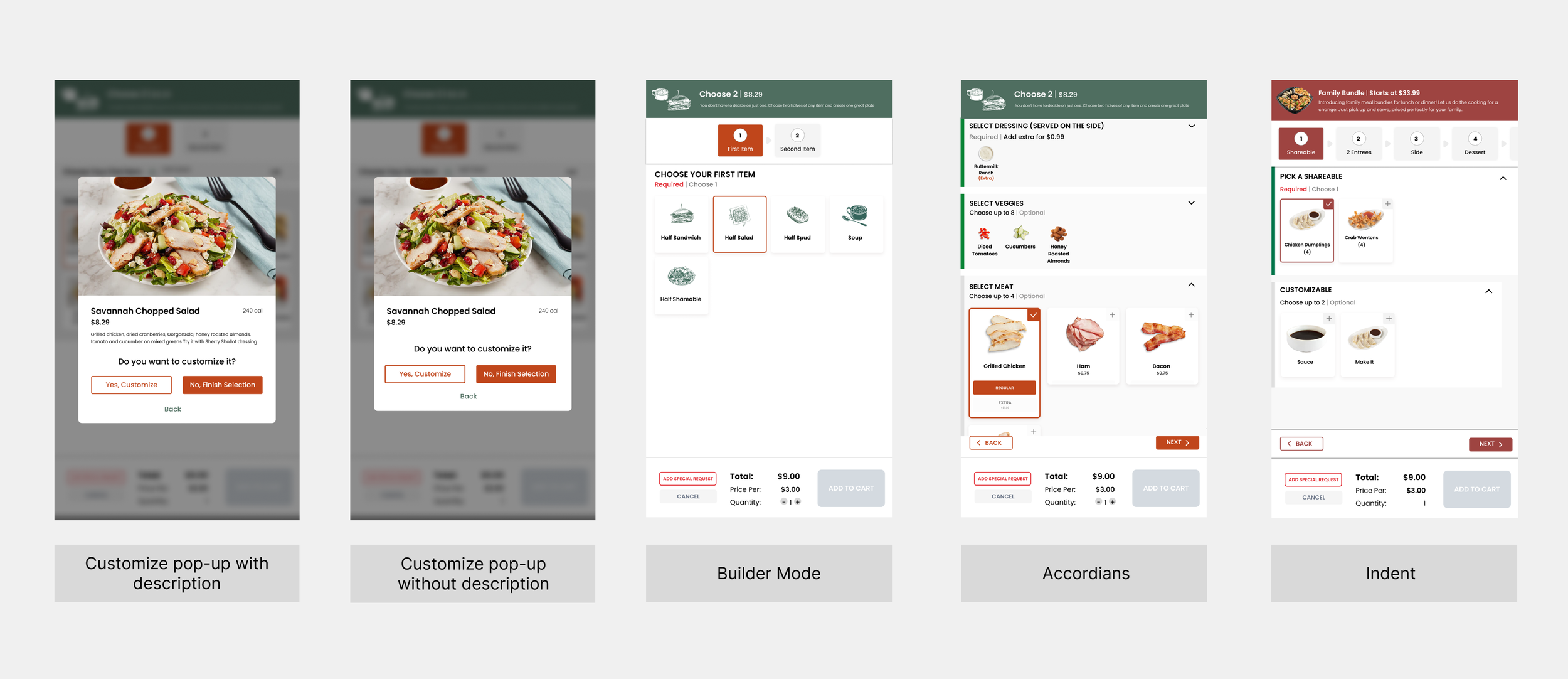
My teammate and I created the flow chart, elements, and variant buttons to address the issue, providing clear guidelines on when items should be broken down into additional nested steps. This approach ensured consistency and clarity at each level of the nesting process. After months of iterating on various designs, the product owners successfully implemented the design solution outlined in the flow chart, complete with distinct rules and clear examples.
Flow Chart
Variant Buttons
Elements
Final Design
Ordering a Burger
In this scenario, the customer can choose to modify the burger or simply add it to their cart to place their order. The only available modifiers for the burger are the buns and toppings, which means the customer doesn’t have to make numerous choices. This streamlined approach allows for selecting buns and toppings within accordion menus, representing our solution in its simplest form.
Ordering a Choose 2 Item
In this case, the top banner shows the user the two stages that must be completed before placing an order, indicating that the item is in builder mode. In addition to our variant buttons, which are accessible on the dressing and allow customers to select multiple sizes without navigating to another page, this scenario also utilizes indented accordions, as illustrated in all the modifiers under the 'Choose Your First Item' section.
Ordering a Family Bundle
This scenario includes an extensive builder mode in the final design of the Family Bundle, with each step presenting its own challenges. To streamline the ordering process, this build incorporates nearly all of our design elements, such as accordions, indents, variant buttons, and quantity counters. Customers can now engage seamlessly without being redirected to different pages, unlike the original solution, which made it difficult for them to track the source of each step.
Conclusion
This project was my most challenging and the one I take the most pride in. More than just the final product, I’m incredibly thankful for the opportunity to experience the entire UX process, as it has deepened my understanding of what it entails. Here are a few key lessons I learned:
1. Failure is Part of the Journey: I didn’t fail; I discovered countless ways that didn’t work. I’m grateful for the regular feedback I sought from my colleagues and mentor, which helped me identify both user interface errors and deeper UX issues. Ultimately, I focused on delivering the best possible solution without letting my personal biases cloud my judgment about what truly benefits the user.
2. Embrace Iteration: I "started over" my project multiple times, using different versions of my Figma file in the early stages to ensure that every aspect of the solution was purposefully crafted. This approach allowed me to explore and find the best solutions for users.
3. Clarify Product Flow: Understanding how to create a clear flow is essential, primarily when multiple potential directions exist. Developing our flow chart was crucial in effectively demonstrating our product's functionality.


