NextGen Kiosk
Improved and designed a new user experience and user interface on Samsung Kiosk
Company: Grubbrr
My Role: UX Research, UI Design
Teammates: Allie Pultorak, Maggie Daigle
Timeline: June-August 2022
Problem
Customers are perplexed by the present kiosk, which fails to fulfill their requests
Customers and clients often expressed frustration with the complexity and difficulty of using the current kiosk. By interacting with it as users, we identified several key issues.
Solution
The aim is to simplify the user interface and experience better and easier
Initially, we identified the issues after receiving feedback from the product owners regarding user behavior on the kiosk. Recognizing the complexity of the current kiosk, we decided to simplify the user experience and interface to make it clearer and more user-friendly. We also researched competitor kiosks, compiled a list of requirements for each screen, and began the wireframing process.
Competitive Analysis
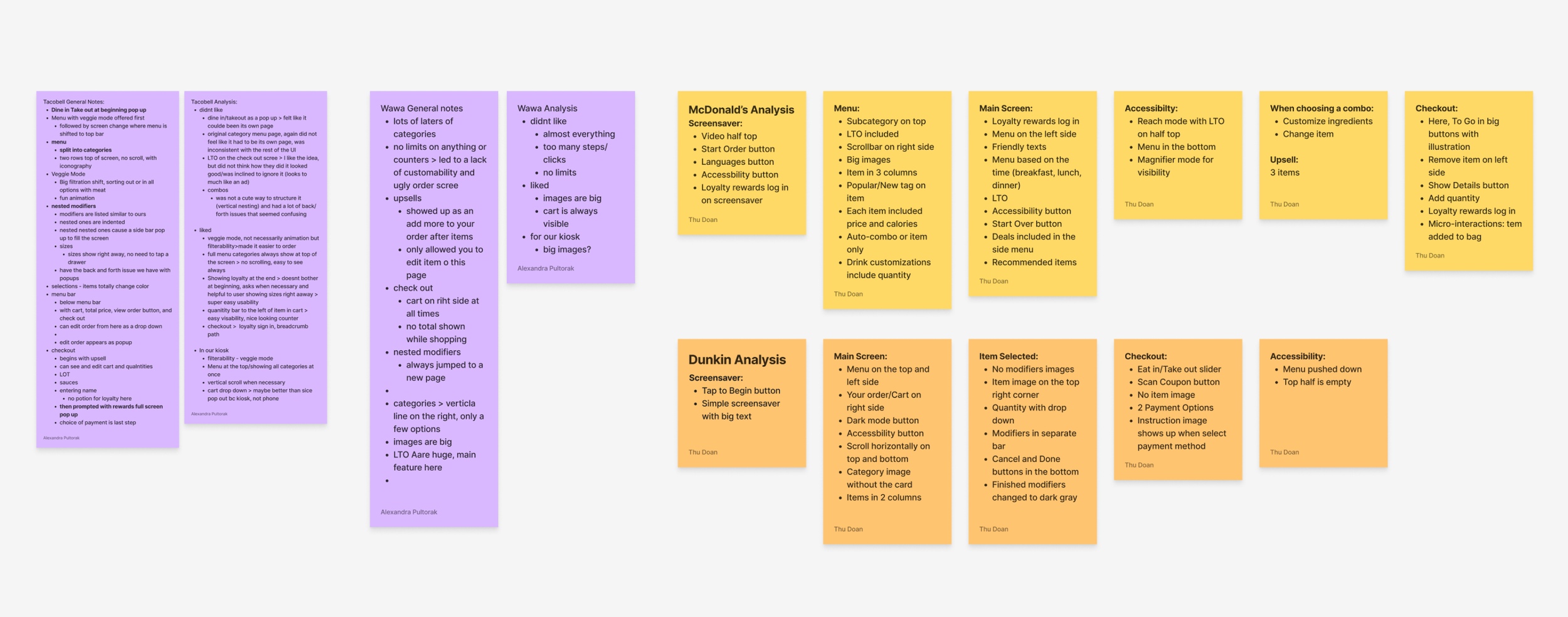
By comparing our kiosks to those of McDonald's, Taco Bell, Dunkin' Donuts, and Wawa, we identified opportunities to enhance the user experience. However, since our kiosk is designed to serve various clients, we needed to ensure a consistent user interface and experience across all of them.
After completing this competitive analysis, we recognized our appreciation for the features these kiosks offered and their ease of use. Since these functions are crucial for customers and help familiarize them with our kiosk, we aimed to integrate some of the successful features already available in our competitors' kiosks.
Planning
After researching the competition, we brainstormed essential features for the kiosk. We compiled a list of functions that should be included on the primary screens of the existing system while also adding features that would benefit customers. Our goal was to demonstrate how simple and quick it is to order from the kiosk, encouraging more customers to utilize our products.
We prioritized a few key functions to ensure our kiosk is as straightforward as possible:
Accessibility — Laws such as the Americans with Disabilities Act (ADA) prohibit discrimination against individuals with disabilities. This includes ensuring access to systems that are essential for those without disabilities.
Allergens Tag—Avoiding specific foods is crucial for individuals with food allergies. By incorporating an allergens tag, customers can easily avoid ordering items they are allergic to.
Checkout — A streamlined and user-friendly checkout process enables customers to place orders and complete payments quickly.
Finding Inspirations
In the visual design process, we began by gathering inspiration from platforms like Behance, Dribbble, and Pinterest. We were particularly drawn to the use of large images that enhance visual interest, as well as the clean, minimalist aesthetic that creates a pleasing overall look.
Wireframe
Once the kiosk's structure and core visual components were established, building the kiosk became straightforward. Using the screen requirements list and the inspiration we collected, sketched some basic wireframes.
Conclusion for the Project
While this project remains unfinished due to my departure from the company, I am proud of the progress and valuable insights gained throughout the process. Key accomplishments include defining the kiosk's structure, developing the core visual components, and creating initial wireframes based on user needs and competitive research.
I envision how the project could evolve, including implementing user feedback, refining the interface, and enhancing features to improve overall usability. This experience has deepened my understanding of the design process and the importance of collaboration in delivering effective solutions. I look forward to applying these lessons to future projects.


